Amsterbold: A Modern Display Typeface for Polished Digital Brands
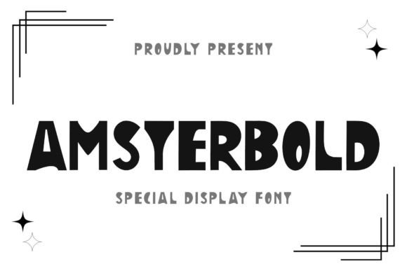
I was staring at a blank Figma canvas, trying to find the right personality for a boutique lifestyle brand’s new landing page. The wireframes were clean, the layout was responsive, but the typography felt flat. It lacked that specific je ne sais quoi that makes a user stop scrolling and actually look at the content. That’s when I pulled up Amsterbold. As an elegant, modern, and quirky display font, it didn’t just fill space; it set a tone. For web designers and digital product creators who are tired of generic sans-serifs dominating every hero section, testing Amsterbold in a real project context reveals why this typeface deserves a spot in your design toolkit.
The First Impression: Hero Sections and Visual Hierarchy
The first test for any display font is always the hero section. This is where you have seconds to capture attention before the user decides to bounce. I dropped Amsterbold into the main headline position for a coaching website redesign. The result was immediate. The font’s quirky yet refined character added sophistication without feeling stuffy or overly traditional. Unlike heavy, blocky display fonts that can crush the visual hierarchy on mobile screens, Amsterbold strikes a balance between boldness and elegance.
When used as a primary heading, it commands respect. It signals that the brand behind it values aesthetics and attention to detail. However, I quickly learned that its strength lies in short phrases rather than long paragraphs. Placing it over a soft, neutral background allowed the unique letterforms to breathe. If you are designing for high-end fashion, creative portfolios, or premium service providers, using Amsterbold for your H1 tags creates an instant editorial feel. It transforms a standard web layout into something that looks more like a magazine spread, which subconsciously increases perceived value.
Readability Challenges on Mobile and Dark Modes
While Amsterbold is stunning for headlines, no responsible web designer ignores the realities of responsive design. I tested the font across various breakpoints, from large desktop monitors down to smaller smartphone screens. On larger displays, the intricate details of the typeface shine. But on mobile, where screen real estate is precious, I had to adjust my strategy. I reduced the font size slightly and increased the line height to ensure the quirky elements didn’t clutter the small viewport.
One critical lesson emerged during dark mode testing. Because Amsterbold has a distinct weight distribution, white text on a black background required careful contrast adjustment. In some instances, the thinner strokes disappeared into the darkness. The solution was not to change the font, but to adjust the background color to a deep charcoal rather than pure black, or to use a lighter weight variant if available. This attention to detail ensures that your brand identity remains consistent and accessible across all devices. Remember, a beautiful font that fails to read clearly on a customer’s phone is a failed design choice.
Font Pairing Strategies for Web Layouts
A display font like Amsterbold needs a reliable partner. You cannot use it for body copy; the quirks would become fatiguing to read over multiple paragraphs. Instead, I paired it with a clean, geometric sans-serif font for the body text and UI elements. This combination creates a dynamic tension: Amsterbold provides the artistic flair and brand personality, while the simple sans-serif ensures clarity, scannability, and usability.
This pairing works exceptionally well for e-commerce sites. Imagine an online store selling artisanal goods. Using Amsterbold for product titles and promotional banners adds a touch of luxury and uniqueness. Meanwhile, the straightforward sans-serif handles product descriptions, pricing, and navigation menus efficiently. This separation of roles helps guide the user’s eye. They notice the headline because of the display font, then smoothly transition to reading the details thanks to the neutral body font. It’s a classic editorial design principle applied to modern web design.
Applications Beyond Standard Headings
Amsterbold isn’t limited to top-of-page headers. Its versatility allows it to be used creatively throughout a digital brand kit. I found success using it for:
- Call-to-Action (CTA) Buttons: While usually reserved for simple text, placing Amsterbold on a prominent "Shop Now" or "Book a Consultation" button can make the action feel more exclusive and inviting.
- Section Dividers: Using short quotes or keywords in Amsterbold as decorative separators between content blocks adds rhythm to long-scrolling landing pages.
- Social Media Graphics: For marketers creating campaign assets, this font translates beautifully to Instagram stories and Pinterest pins. It stands out in crowded feeds where minimalism often blends together.
- Email Headers: Adding a touch of personality to newsletter subject lines or header images helps build brand recognition in the inbox.
For course creators and digital product sellers, these small touches matter. A cohesive typographic system makes your offer look professional and trustworthy. When your design assets—from your website to your email campaigns—use the same distinctive typeface, it reinforces your brand identity consistently.
Technical Considerations and Licensing
Before integrating Amsterbold into a client project or personal site, checking the technical specifications is crucial. Ensure you have access to the necessary file formats for web use, such as WOFF2, to guarantee fast loading times and broad browser compatibility. Fast-loading visual content is a core part of SEO and user experience; a slow-rendering font can hurt your rankings.
Additionally, verify the licensing terms. If you are using this for a commercial client project, an online store, or a SaaS platform, you need a proper commercial license. Many modern font foundries offer flexible licensing options that cover web embedding, app usage, and print materials. Understanding these boundaries protects your business and respects the designer’s work. Also, check for multilingual support if your audience is global. A font might look great in English but lack accents or characters needed for other languages, which can break your layout.
Building Trust Through Typography
Ultimately, typography is a silent communicator. It sets the mood before a user reads a single word of your copy. By choosing Amsterbold, you are signaling that your brand is modern, confident, and detail-oriented. It moves away from the safe, corporate look toward something more memorable and human. Whether you are redesigning a blog, launching a new product line, or refreshing a portfolio, giving your headings a voice with a quality display font can elevate the entire user experience.
As you experiment with Amsterbold, pay attention to how it interacts with your imagery and color palette. Let it lead the visual narrative, but always keep the user’s journey in mind. A font should enhance the message, not obscure it. When used with intention, this elegant and quirky typeface becomes more than just letters on a screen; it becomes a key component of your digital brand’s personality.